Danny Newell
Daniel Newell
Monday, 17 December 2012
Moderator's Message
Hello Moderator, I hope you enjoy moderating my work, as much as I enjoyed doing it. I have split my blog posts up into Planning, Research, Evaluation & Preliminary. Please feel free to use the links I have included within my blogger. Thank you,
Wednesday, 28 November 2012
Film Opening
Here is my film opening. Hopefully it covers the generic conventions of a horror style film.
Tuesday, 27 November 2012
Evaluation Q7
Looking Back At Your Preliminary Task, What Do You Feel You Have Learnt In The Progression Of It To Full Product?
Shot-Reverse-Shot
I have learnt, that from doing my preliminary task the "shot reverse shot" is the best way of showing a conversation that is happening between two people. I didnt use this in my film opening, however, because there aren't any conversations in it.
Match On Action
The match on action shot is the best shot for when you are filming somebody walking around or through a door. When filming a Match On Action shot, you have to use a tripod or have the ability to keep the camera really still, otherwise the shot doesn't fit together very well. I have used this shot in my film opening, to show that i can use many different camera shots.
The 180 Degree Rule
The 180 degree rule is used to show the conversation that is happening or to establish setting from a different angle. I have learnt that when doing this shot it is best to use a tripod or rest the camera on something stationary, as it is very difficult to maintain a steady camera with a free hand. In my film opening, I didn't use a 180 degree shot, as there wasn't a situation where I had two people talking to each other. The location was established via a panning shot, so a 180 degree shot was purposely not used.
Monday, 26 November 2012
Evaluation Q6
What Have You Learnt About Technologies From The Process Of Constructing The Product?
Whilst creating my horror film opening, i had to use a numerous amount of equipment and programmes to attain a decent final grade. I mainly used iMovie, as it was easy to use and I have used it before in a previous project. I obviously had to use a camera and a tripod to enable me to film my opening, and used my apple mac to edit my footage to make it suitable for my target audience.
Sunday, 25 November 2012
Evaluation Q5
How Did You Attract/Address Your Audience?
Here is my film opening again. This time i have added annotations to it, so it answers the question:
"How did you attract/address your audience?"
Saturday, 24 November 2012
Evaluation Q4
Who Would Be The Audience For Your Media Product?
This is 17 year old James Stanley from Bedford. He dresses fairly straight forwardly - usually just a polo top and jeans. He enjoys playing football in the park with his mates and loves going to the cinema on a Sunday night. His favourite place to shop is Milton Keynes shopping centre, as he loves going into shops like Foot Locker and Republic. James enjoys watching horror films like the Saw films, The Exorcist, The Shining and End Of Days.
The music James would listen to would be more underground music, varying from hip-hop and r 'n' b music - he doesn't like to listen to classical music and tries to avoid listening to country music (although his mother plays it all the time at home). He likes to listen to Radio 1extra as he likes listening to Greg James' chart show.
I think our film would appeal to this boy as he is a typical lad who enjoys typical boyish things, therefore, if this film was shown at his local cinema, this would probably appeal to him, as it's similar to other films he likes, such as 'Saw' and 'The Shining'.
Friday, 23 November 2012
Evaluation Q3
What Kind Of Media Institution Might Distribute Your Media Product And Why?
Why have you chosen your production company logo? I have chosen my production company logo because the image of the evil clown on the front, instantly tells the audience that the film is going to be a little sinister and scary.
- What is a production company? What do they do? A production company manages the filming of a movie from screenplay to release. Its main concerns involve managing the budget and supervising all legal concerns.
- What is the job of a film distributor? A film distributor is a company or individual responsible for the marketing of a film. The distributor may set the release date of a film and the method by which a film is to be exhibited or made available for viewing.
- Which film distributor would you choose for your film and why? What other films have they distributed that are similar to yours? If I was to distribute my film, I would use "Brain Damage Films", as they are known for distributing films with the lowest budget. They have distributed films such as; "Nazi Zombies", "Lost Woods" and "The Afflicted"
- How would your film be funded? Lottery? My film will be funded by making adverts and posters to help promote my film.
- Titles - Why do you need them? How have you presented them? I need the titles in my film because they give my audience a much clearer understanding of the people who are involved in my film opening. I have presented them by making the titles have different animations and different effects, making the text more exciting to read.
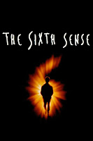
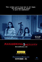
- What films have influenced you from the industry and why? Films with just pure blood and gore didn't inspire me to recreate a film opening. I preferred films that were a little supernatural and made the viewer ask themselves questions, questioning their own eyes. Films such as "The Sixth Sense", "The Shining" and "Paranormal Activity" helped inspire me to create my film opening.
Thursday, 22 November 2012
Evaluation Q2
How Does Your Media Product Represent Particular Social Groups?
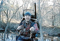
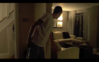
My protagonist is a 16 year old boy, who belongs in the teenager social group. He has been represented as a curious boy who is desperate to know what the sound was that woke him up. Other films such as, Saw III has a protagonist who does the similar movements as the main character in my film opening. The man is curious to know what the sound was that alarmed him. A comparison of my protagonis is the boy from "The Blair Witch Poject" in which he is a curious boy who wants to find out some more information. In my case, my protagonist wants to find out more information about what awoke him from his sleep, and the boy from The Blair Witch Project wants to find out more information about Witches.
In my film opening we can see my character is looking petrified at what he is about to see, and by the look on the boy's face from "The Blair With Project", he looks rather similar. The setting of the two pictures do differ however, my film opening is set within a house and consists of my character moving around the house, whereas in the Blair Witch Project, it is set in a forest/woods.


Wednesday, 21 November 2012
Evaluation Q1
In What Ways Does Your Media Product Use, Develop Or Challenge Forms And Conventions Of Real Media Products? (i.e. Of Film Openings)
This is the contact sheet for my film opening, and here are the 9 frames i have chosen to evaluate on:
- The title of the film
- Setting/location
- Costumes and props
- Camerawork and editing
- Title font and style
- Story and how the opening sets it up
- Genre and how the opening suggests it
- How characters are introduced
- Text Effects
The first frame i have chose to show, is the main title of my film. This does actually come right at the end of the film opening, because i didn't want to give away exactly what was going to happen. I wanted the viewers to feel a little uneasy when watching this opening as they never see the antagonist until the very end of the opening. This is one way in which a horror film opening can be interpreted.
The second frame is one in which the location is established. We can see that the location is only a living room/lounge. The intentions i wanted to get across was that even in your own living room, you are being watched and you are not safe from evil.
In the third scene, i have tried to display costumes and props. I chose to keep the characters in very simple clothing, so the viewers are more focused on the storyline and camera shots. If the characters were wearing bright colours, it would be very suitable for the horror genre, so i tried to stick to white, black and grey throughout the whole film opening.
In the fourth frame I am showing the use of camerawork and editing. We can see it says: "A Danny Newell Film", which was a case of cropping a layer of text over the footage itself. It was quite a simple task to do, but once edited into the film opening, looks very professional and creative.
The fifth frame consists of my protagonist getting out of bed and walking downstairs. I have used a first person camera for this scene because it really makes the audience feel involved and it feels as though they are getting out of bed and walking down the stairs. Here i have used typical conventions for a horror as i have put some sinister music in the background to help build up some more dramatic tension. In this shot, i have also used the same title font and style through out the opening. Viewers like to see the same font throughout as it makes it easier for them to interpret, so that is why i have chosen to achieve this.
The sixth frame includes how my opening is set up. I chose to use some text to set my scene up because the writing was sinister and it fitted the horror genre. The writing consists of: "It hears everything..." and will leave the viewer asking themselves; "What hears everything?" or "Who hears everything?" This leaves the reader asking themselves rhetorical questions.
The seventh frame is when we finally see the antagonist. This immediately shows an example of what things should be included in the genre. The heavy make up on the face and the white wig are two typical generic costumes used to portray the horror genre. That is why i decided to create my film using these factors.
The eighth frame is the one of my protagonists eyes. The music comes to a climax as he hears something wake him from his sleep. I used this dramatic device because it added much suspense to the opening scene. The crescendo of music builds up and then comes to an end when his eyes open. This scene is the scene that introduces my protagonist. He is introduced very quickly as he is the first human thing we see a the start of the opening.
The ninth frame consists of the effects I included in the title sequences. I used a few transitions to make the writing seem as though it is moving and this gives the viewer something to look at when watching the opening sequence of my film opening. I thought it would be a good idea for the words "Sound By" to start on the left, and travel to the right, and the words "David Crow" to start on the right and travel towards the left, meeting in the middle for a brief moment.
Tuesday, 20 November 2012
Audience Feedback - Editing
Do you feel as though the editing of my film opening fits the horror genre?
Yes, I think that the editing did fit the genre because there were times where the cuts were just the right length so the pace of the film was fast and that was what made it scary and sinister.
Has the editing created a 'scary' atmosphere and mood?
Yes the editing has created a scary atmosphere because the camera pans around a lot and we can tell, as the viewers, that the monster or antagonist in the film opening was hiding from the protagonist.
Has the editing targeted my audience of people aged 15 and over?
I think the editing did target the audience because the ways in which the antagonist was portrayed would not be suitable for anyone under the age of 15.
Has the editing reflected the genre that was intended?
The editing has reflected the genre because by changing the contrast and the brightness of each shot, really made the horror genre come to life.
Here is a screen shot of my film screen while mid way through editing my video.
Audience Feedback - Mise en Scene
Do you think the mise en scene fits my genre of horror?
I think the mise en scene fits the genre because there are the typical conventions you expect to see in a horror film and they consist of: a monster or antagonist, the victim, and the scary surroundings.
Do you feel as though the mise en scene creates a sinister mood?
Yes i think the mise en scene creates a sinister mood because the pace of the film opening speeds up and the character shows he is scared. This is what you expect to see form a horror film.
Do you think that the mise en scene suits my target audience of 15 year olds and over?
I think the mise en scene suits the target audience because anyone over the age of 15 should find this opening very exciting to watch, and anyone under the age of 15 may find it difficult to watch at times.
Do you feel like the mise en scene reflects the atmosphere of horror?
I do think the mise en scene creates a scary atmosphere. I like the way the scenes are really fast towards the end because i feel like they create the scary mood and atmosphere.
Audience Feedback - Costumes
Do you think the costume of my protagonist fits the genre?
I think the costume of the protagonist fits the film because he is wearing white and grey. Two simple colours that attract our attention to his face and not what he is wearing.
Do you think the costume of my antagonist fits the genre?
Yes, I think the costumes for the antagonist fits the film genre because she is all dressed in black and because you can see no flesh, it gives the impression that the antagonist isn't human.
Do you feel as though the costumes used for my characters create meaning for my genre?
I think the costumes used do create some meaning for the genre because the genre was Horror, and the costumes were very basic and simple which drew viewers away from the clothes and towards the camera shots and the mise en scene.
Do you think the costumes used targets my target audience?
I think it does because the protagonist wore grey jogging bottoms, something everyone has at home and so it is almost saying that this situation could happen to anyone.
Production Log - Sound
Sound:
Where have you got your music from?
I got my music from a royalty free website. I am using a track called "Bent & Broken". I got it from this website: http://incompetech.com/music/royalty-free/
Why could you not use copyright music?
I have not got money to pay to use it, and I have no rights to use it as it is not my music.
Production Log - Editing
Editing:
Are you in schedule?
I am on schedule at this moment in time as i have started editing my final footage. I am still editing at the moment and will be submitting my work on time with the deadline.
How is it going?
Editing on a whole is going quite well. It has taken me a shorter time than what i expected to edit my film as i thought it was going to take a few weeks. It has only taken me a couple of days to do this and i am surprised that iMovie has been so easy to use. I have had some problems with the actual programme itself. It keeps freezing and i have lost all my work on a couple of separate occasions but have managed to start again and re-do it before the deadline.
What programme am i using?
I am using iMovie and it has been surprisingly co-operative. As i mentioned earlier, it has sometimes unexpectedly quit and has deleted my editing but i haven't ever lost footage because i kept it on my camera.
What are the advantages and disadvantages of this programme?
The advantages of this programme is that it is very simple but also effective to use. I like the fact that there are a few different transitions to chose from, but the disadvantages are the fact that there are lots of tricks and editing techniques i have wanted to use but have not been able to because the programme is quite basic, and doesn't have the effects i wanted to use.
Monday, 19 November 2012
Production Log Filming
Production Log Filming
Filming:
How did it go?
I think my filming went well. I had to re-film it because i wasn't happy with my first version.
Filming:
How did it go?
I think my filming went well. I had to re-film it because i wasn't happy with my first version.
Did you change anything from your planning?
I originally intended to use fake blood and knives in my film opening, but i eventually decided against it because i feel that the blood and knives were not apropriate to the genre. I wanted it to be more of a psychological and sinister film, raher than just blood and gore.
What were the difficulties?
The only difficulties i came across was finding an effective way to film. I originally filmed why whole film with just a freehand camera, but i then went and got a tripod and i have found it so much easier to film now as I don't have to have someone filming me all the time.
Are you on schedule?
I am currently on schedule as I have re-filmed all of my work and have now made it a better version. Because i used a tripod, all the footage is much more still and there are no shaking hand shots unless i want there to be, for example: When my character is looking around the room when he is scared, i want there to be a little bit of a shake to make it show the fear inside my character.
Friday, 26 October 2012
Task 19 - Storyboard For Film Opening
My Storyboard For Film Opening
Here is my soryboard for my film opening. I have shown the order in which my scenes come, and a quick snapshot of what is happening in each scene. I have also shown the times at which these scenes will happen.
Monday, 15 October 2012
Task 18 - Scripting
Script For My Film Opening
{Danny goes to sleep at night}
{In his dream he imagines himself walking downstairs and seeing a demon down there and gets chased by it}
{Demon grabs his leg and pulls him across the floor}
Danny: "Nooooo!"
Demon: *Chewing Sounds*
{Danny wakes up}
"Ahh, it was just a dream..."
{Danny opens the door to exit his bedroom}
{Demon is standing across the hallway looking away from Danny*
*End Of Opening*
Wednesday, 10 October 2012
Task 17 - Timeline Planning
This is my timeline plan for my film opening. I have taken a photo of the order in which my titles and scenes occur in my film opening.
Tuesday, 9 October 2012
Task 16 - Costumes
I am going to use some bed sheets because when i blur some of the image out and change the effects of the shot, bed sheets will look like ghosts and can be wrapped around an actor to seem like they have come back from the dead.
I am going to be wearing grey jogging bottoms in my opening because they are really plain and it is realistic because that is what someone would be wearing.
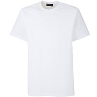
I am going to be wearing a plain white T-shit because i want to make it seem realistic, but also i want to wear something plain because i want the viewers to be focused on the facial expression and camera movements, and not what I'm wearing.
I have chosen to dress my antagonist in black because it is very plain and simple and it draws the attention towards the face of the demon, as opposed to what she is wearing. The collar of the shirt covers the neck and so the whole of my character is covered from head to toe in black clothing.
Again, i have chosen to use black trousers for my antagonist because i want the viewers attention to be focusing on the actual character and the camera shots and not what they're wearing.
Monday, 8 October 2012
Task 15 - Locations
Here is a google map screenshot of my house. I am going to record my opening scene here.
-------------------------------------------------------------------------------------------------------------------------------------------------------------------
Another location I am going to use is my bedroom. I am using this location because I want to make the film opening feel realistic and appropriate to the genre. I want the viewer to feel like they are actually part of the film and make sure they can emphasise with my character by being realistic and suitable for my genre.
-------------------------------------------------------------------------------------------------------------------------------------------------------------------
I am going to use my hallway as a location. Hallways are always a spooky and eery place to be when it is dark and everyone is asleep. I want to portray this in my film opening. Hallways make suspense more effective and so that is why i am using a hallway in my film opening.
-------------------------------------------------------------------------------------------------------------------------------------------------------------------
I am going to use my living room/lounge for my film opening, as i have very effective lighting in there. The spotlights allow enough light to come through the camera and make my shot look sinister.
---------------------------------------------------------------------------------------------------------------------------------
Sunday, 7 October 2012
Task 14 - Prop List
Here I have chosen to use a knife as one of my prop. I have chosen a long pointy knife because it insinuates pain and a sharp painful way to die. I want this to be reflected in my film.
Here I have chosen to use a bandage. I am going to wrap up one of my actors to create a 'Mummy' effect and this will be one of my main antagonists.
I am going to use red dye and put this on the bandages and the knife to show the connotation of blood and the seriousness of the situation my character is going to be in.
I am going to use a bed as a prop in my scene. I want to put across the message that even in your bed, your not safe from my antagonists in my film opening.
Task 13 - Mood Board
This is a mood board that i have created on my genre of Horror. I have chosen to use images of characters and particular film covers of films in the horror genre. It shows what sort of things I am going to include in my own film opening, and this will be a reflection of my own individual work.
Friday, 5 October 2012
Sunday, 30 September 2012
Task 11 - Media Footage Shazad & Luke
In this short video, i have demonstrated the use of over the shoulder shots. I filmed Shazad walking through a door and then he sits down and starts a conversation with Luke. When Shazad is talking, i am filming over Luke's shoulder. When Luke is talking i am filming over Shazad's shoulder. When the conversation stops, i make sure i get both of the boys in the shot.
Saturday, 29 September 2012
Task 10 - Story Board
Here is my story board where i have done a simple scene of jim sitting around a table with his friends. I have demonstrated the different camera shots and camera angles in this storyboard.
Friday, 28 September 2012
Task 9 - Preliminary Task
Script
Jack: I
can’t believe Arsenal lost to Chelsea at the weekend!
Sam: I know
man! Arsenal was all over them as well!
Jack: Can’t
believe we didn’t score! We had about ten shots on target as well!
Sam: I
went to watch it at The Emirates you know!
Jack: Makes
it even worse when you lose a home game.
Sam: Tell
me about it.
Thursday, 27 September 2012
Task 8 - Production Company Logo
Major production companies are more focused on the total amount of sales their film completes. There main aim is to promote the film and to make money in the process. This is the case with big hit films such as; Avatar. In this example, 20th Century Fox have tried to target a wide range of audiences in order to increase the amount of sales figures the film determines.
Independent production companies have made the decision to target a certain target audience and almost has a hooked effect on them. By creating films that appeals to a certain niche, reduces the chance of the film being a hit and miss. You can almost guarantee sales from independent production companies. An example of an independent production company is; Tica Productions. Tica have produced films such as 'Nice Guys Finish Last' and other comedy shows like that. They target a certain audience.
Amicus Productions and Brain Damage Films are two examples of film companies that aid in the process of making horror films. This is important to me because i have chosen to make my film opening in the horror genre and so I can relate to these companies.
When you compare my logo to the one displayed here, we can notice that they both have the main simple image on the front, and then the name of the production company follows. They are both eye catching and immediately inspire you to look at it. With production company logos, I have personally found that lots of production companies like to use the colour red in their logos as it is a connotation of blood and gore, especially with logos that are designed for the horror genre.
Wednesday, 26 September 2012
Task 7 - Horror Questions (Flip Camera)
1. What is the
genre of film you are creating?
The film I am creating is going to be a horror film. I have chosen to do
this because I want to be able to be in control of my viewer’s emotions and I
want to scare them and give them an adrenaline rush.
2. Who do you
think the target audience for this genre is and why?
I think the target audience for this genre will be people aged 15+ because
I feel that if anyone below the age of 15 was to view it, they would feel
disturbed and out of sorts. For example, I want to do a scene involving a ghost
and I feel this would be inappropriate for anyone aged 14 and under.
3. What
demographic do you feel would watch your film?
I think people with a high economic status would enjoy watching this film,
as it is an intellectual showing as well as a scary one. I also think that this
film would be suitable for men and women as both genders can have a love for
the horror genre. I am aiming for the C1 & C2 category, as they are the
ones who will find this film easiest to interpret.
4. What BBFC
classification will your film fit into? What effect will this have on your
target audience?
My film will fit into the 15 rating. I say this because I want to use some
strong language but not too much. And every swear word will be in context and
will not be over the top. I think that this will have a positive effect on my
audience because even adults who are well over the age of 15 will still be
interested in watching the film because it is still rated at an age where they
know they’re not wasting their time.
Tuesday, 25 September 2012
Task 6 - Nine Frame Analysis
1. In the first screen shot frame we can see someone throwing someone else off the edge of a flight of stairs. This gives us the impression that the characters in the film are not nice ones. This frame gives us an idea of what the film as a whole is going to be like. We can instantly tell that this film is going to revolve around death and people getting killed.
2. In the second screen shot we can tell that this film is also a hybrid genre, as it has all the generic conventions of a horror film, but also includes pieces of comedy which makes us instantly realise that this film is not just a plain horror.
3. There is an explosion in this scene and we can see three characters running away from the exploding car. One of these characters is a zombie and is clearly chasing the other two. This does have a funny effect because it is clearly stating that the main problem is the explosion from the car, yet the zombie is still trying to devour the two characters.
4. There is a comical effect in frame number four, as there is a close shot of a zombie's face being pushed up against a riot shield. This adds humour to the film as when a persons face is squashed up against glass or plastic it is a funny sight.
5. In this scene a human is being chased through a field by a zombie. This is quite scary but also makes you laugh because the facial expression on the zombie is comical.
6. On this frame the character at the front is being chased by two zombies (a male & female) and this is funny because the facial expression and body language on the character running away is really exaggerated. This is also funny because the character is overweight and seeing him running away adds much humour to this scene.
7. In this frame the characters are again, running away from the zombies. There is a group of zombies chasing the characters, and the characters being chased is a child and his dad. This is disturbing because there is a child involved which instantly makes the scene feel much more worse.
8. In this frame we can see that there are two firemen who are trying to put out a fire. This adds some mystery to the horror film, as it makes us want to find out whats caused the fire thus watch the film.
9. In this final frame, a zombie has just been hit round the face and is on his way to the floor. We can see lots of blood flying off the zombies face so he has obviously been hit with something. This shows that eventually the humans triumph over the zombies and end up winning the battle. This individual frame is quite comical because it is a really over exaggerated fall to the floor.
Task 5 - Certificate Ratings
Here is my certificate ratings. I did this on youtube and gave information about each certificate genre, ranging rom 'U' ratined films, to '18' rated films.
Monday, 24 September 2012
Friday, 14 September 2012
Task 3 - Genre Cloud
This word cloud research is useful to the planning of my
film, because it enables me to use the generic conventions in order for me to
create this film opening. For example; ‘Blood’ and ‘Death’ are two words that
paint pictures in our head of a red coloured blood with insinuates killing and
brutal murder. From this, I can tell that the genre i have chosen is Horror. By doing this task it helps me understand the generic
conventions of my genre, which will help me incorporate these in my final
production.
Wednesday, 12 September 2012
Tuesday, 11 September 2012
Task 1 - Timeline Of Film Opening
'Dirty Harry’ Title Sequence
Clint Eastwood (1:51)
In A Malpaso Company
Production (2:04)
‘Dirty Harry’ (2:13)
Co-staring Harry Guardino,
Reni Santoni (2:25)
Andy Robinson, John Larch
(2:35)
Featuring, John Mitchum, Mae
Mercer, Woodrow Parfrey, Lyn Edginton, Ruth Kobart (2:45)
Josef Sommer William
Paterson, James Nolan, Maurice S. Argent, Jo De Winter, Craig G. Kelly (3:06)
And John Vernon As “The
Mayor” (3:17)
Director Of Photography Bruce
Surtees (3:30)
Subscribe to:
Comments (Atom)


